Best Sign Visibility
Determining the visibility of your sign involves consideration of the viewing distance. Letter height and width are the most important variables in the visibility of your sign. In addition to the size of the letters, the font style, color, contrast, location and design elements such as borders and backer panels also enhance sign visibility.
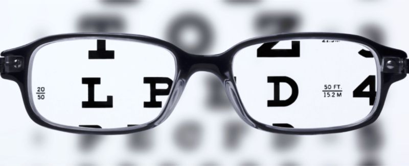
A widely acknowledged standard for determining visibility at particular distances is outlined in the chart shown:

Sign Location
When designing your sign, consider how you will be using it, as well as how far away the readers you want to impact will be. For example, if you are placing a sign on the window of your retail store, your text only needs to be visible to the people walking by the store on in the parking lot. 3-4” letters (or smaller) would work just fine. However, if you are hanging banners and want drivers on a nearby highway to be able to see them, you want to design your letters at 8” or even larger.
Color Scheme
Another important factor is to use contrasting colors when designing your sign. Text color with a contrasting background significantly increases the impact and visibility of your sign by making your text stand out more. On the other hand, using a background color that is similar to the text color can make your message almost impossible to see at any distance. For instance, you wouldn’t want to have a red sign mounted on a red brick facade. If your logo happens to be red and you’ve leased a space that has a red brick facade, then a white border around your letters will greatly enhance the visibility of your sign. Some of the most-visible text colors include black, red, and white, each of which can be seen the best with a contrasting background color. Readable distance can vary 10% depending on various color combinations.