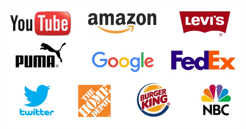
What do these logos have in common?
Simple, well defined, easy to read fonts. Short, easy to remember names.
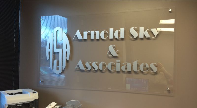
When creating your logo carefully consider the font. Thin, serif, decorative and script fonts can be harder to read than sans serif fonts and often times the former don’t translate well into signs.

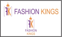
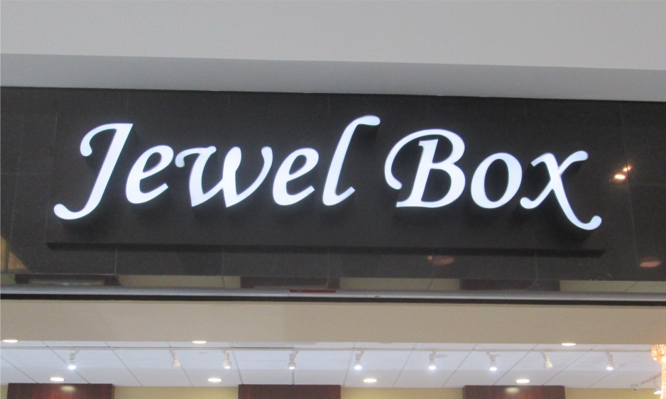
And whatever you do, don’t design your logo in a script font using all uppercase letters. Script (or cursive handwriting) was never intended to be in all uppercase letters. As you can see in the example to the left, the bottom image is much easier to read than the top image.
If your business has more than a one word name, you will need to design your logo so that it works well in both landscape and portrait applications. This is especially important when it comes to retail signs. Some storefronts are wide and can accommodate a landscape logo, while other are narrow and only a portrait logo will work well.
Consider these five tips from Entrepreneur.com:
Don’t be generic.
Your logo needs to convey what you do and who you are, and leave a positive brand impression. That’s why small business logo design is a different animal from corporate logo design. Corporations can throw enough money into marketing to ensure that people associate any symbol or graphic with their name. Small businesses don’t have that luxury: Each impression is so important. You need to very quickly connect with your audience members and give them something to latch on to — at the same time that you give them something disruptive in your competitive space.
Pick typography that reflects what you stand for.
The vast majority of small business brands are built upon two primary elements: their typographic elements and their graphic or iconic element. Together, these factors form the basic structure for most logo designs. Typography communicates much about your brand — whether it’s a brand that’s whimsical or elegant, established or common, fresh or futuristic. Your typography should be in harmony with, and balance with, the graphic or icon in order to optimize the audience’s first impression.
Choose colors wisely.
Certain industries have very typical color palettes that are traditional to their industry. For example, heating and air conditioning companies often use red and blue in their branding.
Consider how your logo will be used.
Whenever possible, avoid using a logo that requires a lot of explanation. If your small business relies on outdoor media, such as signs or vehicles, a memorable icon is especially important. One simple test is to cover up the lettering and simply look at the graphic. Does it give the viewer an idea as to the nature of the business?
Hire a pro.
With so much of your success riding on how well your branding performs, this isn’t the place to cut corners. Yet, so many businesses look for the least expensive option, because they don’t understand the value of a good brand and how it will affect their chances of success. The most important part of any branding exercise is an open dialogue between the brand strategist and the client. Choose a firm where you will speak directly with the person developing your brand.